Alcohol Consumption Rates
At Public Events
I was a catering company"s bar manager in Georgia and began collecting a lot of data. Since then, I"ve seen other companies, and found that nobody really went as deep into the analyses as I had.
I wasn"t able to collect as much data as I would"ve wanted to get the best analyses off the ground, but I did start to get the basics of the patterns that govern the basic catering event.
- 1.5 ounce shots
- 5 ounce wine
- 1 can of beer
Believe me, there was a great deal of discussion about whether or not our bartenders were pouring that amount, and what modifications needed to be made to my calculations and expectations given that potential offset. As an aside, I actually found tha the data didn`"t seem to suggest a dreadful financial problem with overpouring. I instead found that there were much more interesting things to discover, explore, and calibrate as a manager than terrorizing my bartenders with minutia. This is partly because of the economic context that a catering bar finds itself in, in contrast to a downtown bar.
I was not the least bit discouraged by the great variety of parties we executed. It simply meant that a skilled data analyst would need to do more layers of investigation to get things clear, after which they"d learn even more interesting things than if it had been simple. For instance, some of our events didn"t offer liquor (only beer and wine). This of course influences, in and of itself, the amount people drink. Below you can see the variation in bartime itself, which also has a great deal of impact on how much people drink, across events with open bars.
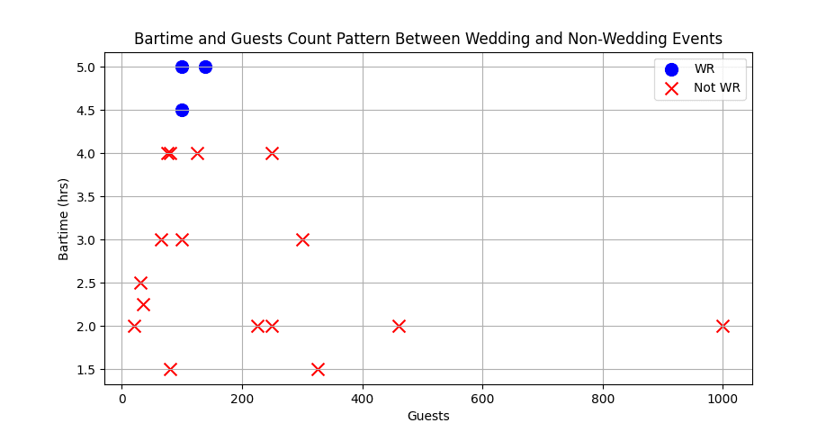
This image shows a pretty usual pattern for public events. Even a long-winded business dinner with lots of speakers has a hard time lasting quite as long as a wedding. In addition, the more people that come the more expensive the open bar is for the host per hour. It"s also worth noting that the more people gathering for the event, the less tightly knit the community is around an event of shared importance, making people less interesting in drinking, and much less interested in partying for 5 hours.
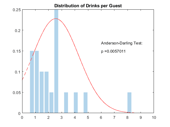
This graph is a bit sad, since I never ended up collecting a sufficient quantity of data for the obvious underlying pattern to be clear to the naked eye. Despite this, a particular statistical test already claims to detect that the curve is "normally distributed."You can tell from the correspondence in height that I only had around 20 data points — with the shortest bars representing just 1 event. I believe based on the following graphs that this distribution has two underlying curves, and when combined, given enough data, would reveal two peaks, which is captured here. More on this later.
If you think about it, the graph below is essentially the graph above, looked at "top down." That is, looking at the top graph is equivalent to standing on the line and looking along its length. (For unimportant reasons I believe these two graphs were different data sets.)
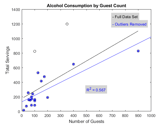
I can say from experience that the outliers chosen definitely constitute uncommon occurrences. I hate to remove any data points, since the claim of outlier-ship is riddled with problems, but I could say from the beginning I wasn"t happy with the representativeness of the sample, having witnessed the background pattern already for a good length of time.
For instance, the 800+ drinks for around 100 people was a wedding that seasoned employees came back from stunned at how much those people drank.
I find that the above normal curve is about right. 6 drinks/person is a pretty intense party. You always have to keep in mind that none of this data is split by person, so what happens in reality is, even at a very drunk event, a good number of people have just two glasses of wine, while a portion of people get 8-12 drinks. That"s what gets you a 6 serving/person average, and a party where a good number of people aren"t particularly able to walk.
Of course, it became a frequent critique of my statistical analyses in general that parties are simply too different from one another, which is simply a lack of imagination. A small subset of hyper-relevant factors subsume the predominant portion of the variance in drinks consumed per person, because individuals, especially drunk ones, are using a rather simple set of heuristics to determine how much to drink, and across repetitions any deviations from that underlying heuristic get washed out in the averages. It is not only a complex system, it is an adaptive system, and therefore follows a normal distribution whose standard deviation can be reduced substantially by controlling for a small number of primary contributing factors.
The primary of these contributing factors is bartime. I began trying to collect a dataset that included bartime — easier said than done, since there"s dozens of people on the other end of this, some of which were (I"m not kidding:) angry at me for approaching the position with statistical procedures that they considered foreign and unlikely to be fruitful, as well as hard to understand and explain. Determining bartime was the kind of data point that rested just beyond the pale of easily accessible data, for which workflows already existed. While in principle it could become a robust metric, in practice, as things were, it remained a somewhat fudgy one.
I never collected quite enough to reach a minimum for proper statistics, which I had been taught was, and felt was plausible to be around, 25 data points.
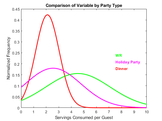
Here, just by splitting by general category (which, admittedly, isn"t always easy, since, as they said, we did have a pretty wide range of events), and removing the events which deviated outside of the categories in a notably uncommon manner, some serious narrowing of the curve occurs. This decision of exclusion had to be made carefully, since simply excluding all odd "Dinners" would artificially make Dinners appears to be an invariant distribution. What we want, in order for the graph to not lie, is for the category "Dinner" to genuinely contain a representative sample of the normal variation within the category, in a robust manner.
Sometimes it"s hot outside, sometimes there"s a higher prevalence of extroverted people at the party, sometimes its a protestant wedding. This is all normal variation. If a miscommunication results in the party having no beer or wine for 3 hours, that"s not a good example. It takes experience to determine where that line is though, when the ambiguous cases arise.